We don’t often think of computer science and design as being fields that can learn from each other. Having studied the first and practiced the second, there are a few ideas that I can see being of huge value that designers can learn from the more technical side of the digital world.
One of the most significant is the idea of abstraction.
A view from above
Most of us abstract things all the time, but we may not know that we’re doing it, and may not be able to consciously use it as a tactic to help us make sense of something.
A classic example of abstraction is the ‘birds eye view’. If you imagine being on a particular street in a town, you can build up an idea of the place from that position. But to get more of a sense of the whole town, you could produce a drawing or photograph of it from a higher point. This gives you less detail, but a wider view and more emphasis on specific parts that you’re interested in.
While the street view can show you what the street is made of, what kind of people are there, the architecture or the kinds of things in the shop windows, the birds eye view shows you how streets relate to each other, different districts or maybe the directions that traffic flows between areas.
Both of these things are useful. Often, we get stuck in one mode or the other. Being able to use abstraction well gives us more opportunities to develop a deeper understanding of what we’re looking at, and helps us make better decisions as a result.
But we don’t have to stop at two levels. We could zoom out further to map a whole region, perhaps to understand the topography or the road system. We could zoom out further to a country level and see patterns there, and better understand the role of the town within it.
And of course we could zoom in too; we could focus on a particular row of shops, or the condition of the pavement.
In the CS world, a technique like this helps you model concepts in hierarchies and teach computers how to move information around your system.
How does this relate to design though?
Example: Understanding a user need
Abstraction works well in mapping spaces, but we can also use it to map concepts. One hard-to-define concept in the world of design is the ‘user need’. Most of us have an intuitive idea of what we mean by this; if I ‘need’ something, it’s something useful or essential to me that I may or may not have access to.
The problem with using a word like ‘need’ is that it can describe situations at may different levels of abstraction. This means that when we try to have conversations about needs, we can often be talking past each other, or delivering on one aspect while failing to actually solve the real problem.
Drills and holes
The classic example of this is the ‘quarter-inch hole’ business myth. Quoted in various forms by many during the 20th century, the story goes that a business leader blew everyone’s minds by stating that ‘people don’t want a quarter-inch drill; they want a quarter-inch hole’. The implication being that you should think a level above what the product you’re selling is ostensibly doing.
But we can keep going with this…
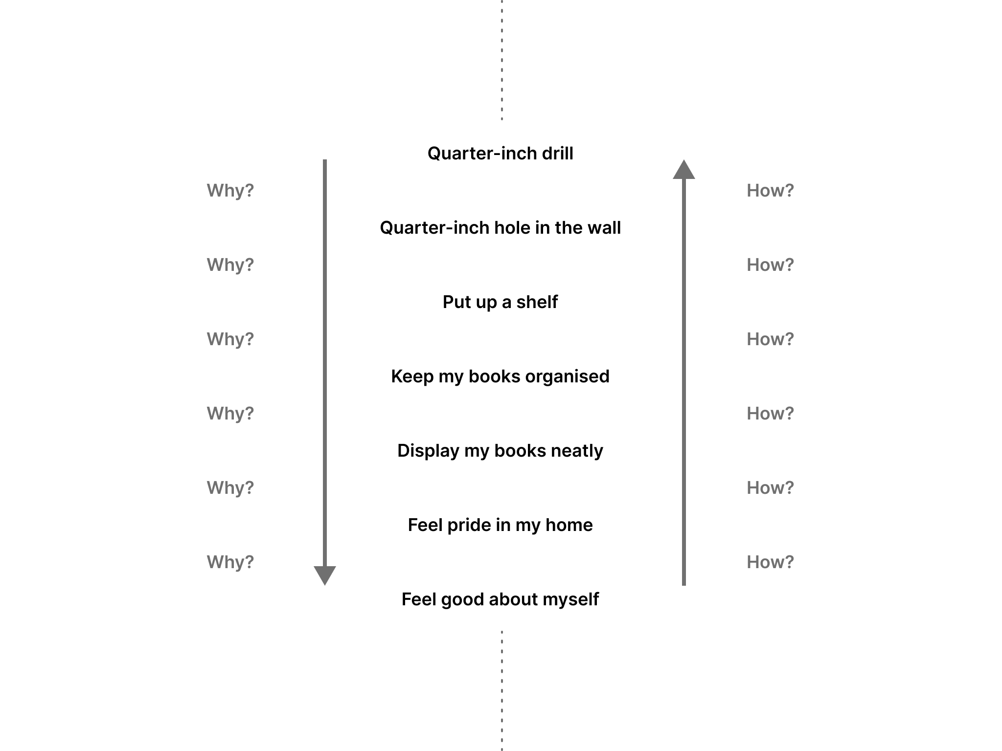
I want a quarter-inch drill.
Why?
So I can have a quarter-inch hole in the wall.
Why?
So I can put up a shelf.
Aha! So this changes our perspective again. What might we do differently if we were thinking at this level? Could we remove the need for drills and holes entirely, making something more convenient and less damaging to the wall?
…and why stop there?
I want a quarter-inch drill
Why?
So I can have a quarter-inch hole in the wall
Why?
So I can put up a shelf
Why?
So I can keep my books organised
Why?
So I can display them neatly
Why?
So I can feel pride in my home
Why?
So I can feel good about myself
Ok! Now we’re getting somewhere. We’ve mapped this need all the way back to something quite fundamental and primal. And there we were, thinking this was about drills and holes.
At this point, you might be reminded of the original hierarchy of needs, credited to Abraham Maslow.
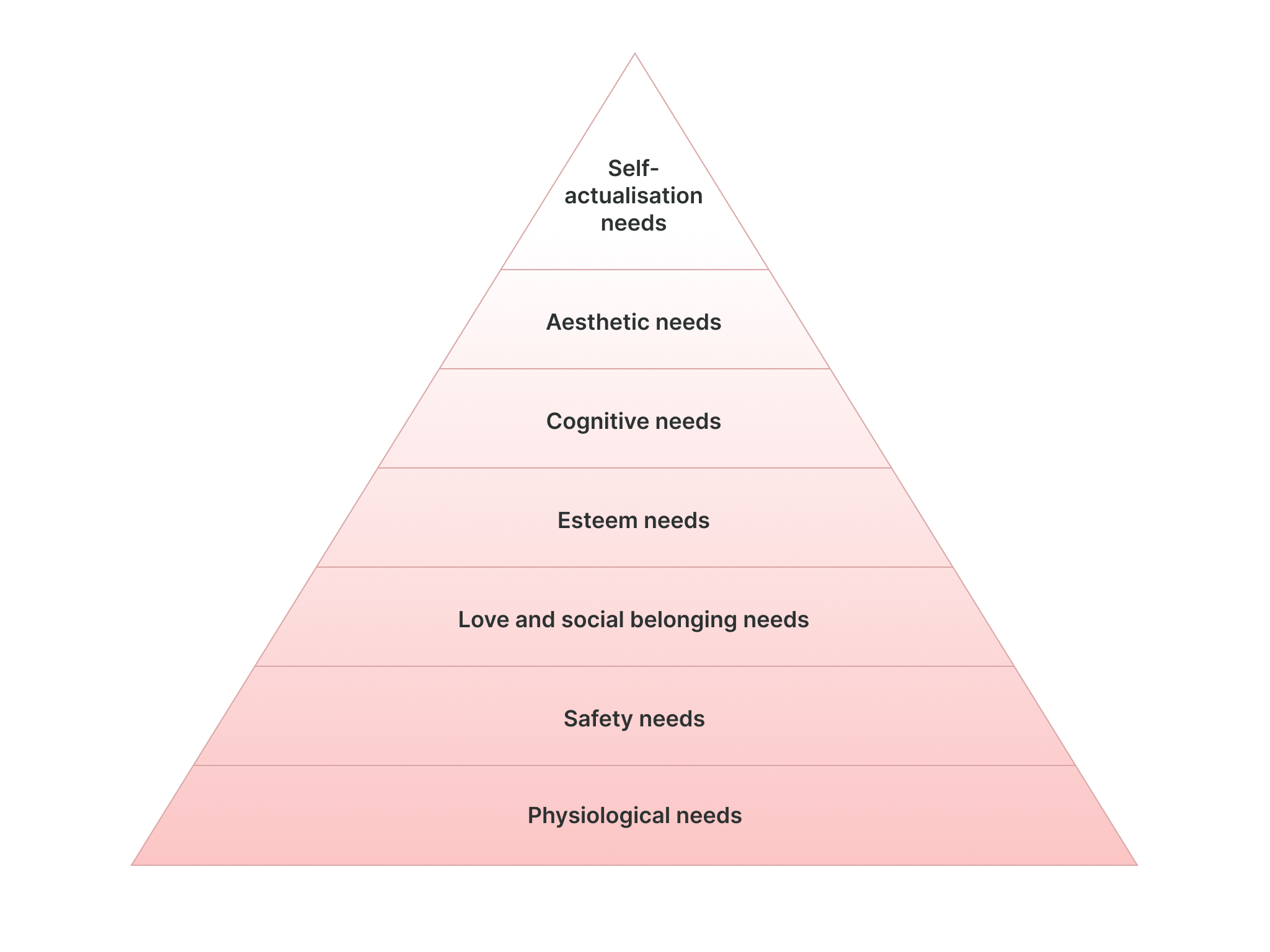
This is also an abstraction, and a useful one for understanding other dimensions of what ‘need’ could mean. It’s even more abstracted than the quarter-inch drill example, because we’re not talking about specific situations, but groups or types of our most fundamental needs and how they relate to each other. It’s not showing us everything to do with needs, but it shows us something that other perspectives don’t.
With all of these different ways of defining ‘needs’, it’s starting to feel like we might need some slightly more specific terms in order to have useful professional conversations about solving people’s problems…
Why and how
I call a chain of needs like the quarter-inch drill example above a ‘Y-chain’, because you’re exploring a chain of ‘whys’. These can be useful to map out in themselves. But another powerful thing about exploring needs in this way is that you can move in the other direction too. This time, instead of a chain of whys, you get a chain of hows:
I need to feel good about myself
How?
By feeling pride in my home
How?
By displaying my books
How?
By presenting them in an organised way
How?
By ordering them on a shelf
How?
By drilling holes to support it
How?
By using a correctly sized drill
The great thing about this is that you can start at any point in the hierarchy, move in either direction, and explore the problem and solution space. By moving in different directions, you can rapidly switch between the diverge and converge modes of design thinking to explore possibilities that might have taken a lot longer to unearth without it.
If you like, you can now merge the two chains together to show ‘why-so’s going in one direction and ‘how-by’s going in the other:
Getting your story straight
This visualisation isn’t perfect; you might have noticed that these examples could branch off in multiple directions, since there could be many possible reasons for doing something and many possible ways of fulfilling a need (both at once or just one of a set of alternatives). But now look at a typical user story that might get drawn up in a situation like this:
As a DIY enthusiast
I want to purchase a drill
So that I can make a hole in the wall
Suddenly this feels very shallow, and while it gives you some context, it leaves a lot of unanswered questions, and if taken uncritically can end up leading you down specific paths for arbitrary reasons. The format is also open to being used at any level of abstraction, meaning you can potentially have a list of stories that range from post-hoc justifications for features like ‘I want a submit button’ to more fundamental tasks like ‘I want to organise my books’. Operating from a list where the items are inconsistently framed is a recipe for confusion.
Abstract all the things
While this post focuses on a specific use of abstraction in the context of user needs, being able to understand what level you’re talking at and what level someone else is talking at can be a critical skill in communication, and helps us recognise when (and why) we might be talking past each other. Whether it’s a y-chain or Google Earth, visualising levels of abstraction in some sort of model or map can help improve the situational awareness of you and your team, help orientate a discussion, and ultimately allow you to make better decisions about the design of the products you create.